


Saturday, 12 February 2011
How to Create High Quality Metal 3D Text in Photoshop
Posted by Tien Dung | Saturday, 12 February 2011 | Category:
3D
|
0
comments
Final Product What You'll Be Creating

Step 1
Let’s start with a new document of 1500 pixel by 1500 pixel, and 300px/inch resolution. Create a new layer, name it "3D TEXT_first." Then grab the Type Tool (T) and type big letters of your desired text, in my case it’s written as 3D TEXT. Also don’t worry if your text goes out of canvas, it has to be very big. Because we’re going to rasterize this layer and distort it in the next step.
Step 2
So now, right-click on the "3D TEXT_first" layer and select Rasterize Type. Then use Edit > Transform > Distort and create a nice perspective to our text by dragging the corners. Make sure your text is way smaller. This way you won’t lose its quality and the text won’t get blurry.Tip: If you fail by distorting, and some text edges look fuzzy, use Filter > Sharpen > Unsharp Mask, and increase the Amount.

Step 3
Now that the text is way smaller and has a nice perspective, create a duplicate (Command + J) of this text layer and name it "3D TEXT_last." Switch to Move Tool (V) and use keyboard arrows to position the "3D TEXT_last" layer a bit above the "3D TEXT_first" layer. In my case this was 16 pixels up and 2 pixels right.
Step 4
Create duplicates (Command + J) of both text layers and position them as you see in the image below. Make sure you have exactly the same order as shown, as it’s important!
Step 5
Now turn off "3D TEXT_first" and "3D TEXT_last" layers. Select the "3D TEXT_first copy" layer and make around 60 copies (Command + J). Now, select "3D TEXT_last copy", go all the way down to the bottom of Layers Palette, hold Shift and left-click on the first "3D TEXT_first copy" layer – this should select all 60 layers. Next right-click on those layers and select Link Layers.
Step 6
Switch to Move Tool (V), select "3D TEXT_last copy" layer. Go to the upper toolbar of the move tool. Click on Distribute Vertical Centers and Distribute Horizontal Centers. Then notice that our letters were perfectly distributed creating a nice 3D shape. Next, select all linked layers and merge (Command + E). Name this layer "3D TEXT_merged."
Step 7
Go to Layers Palette, turn on "3D TEXT_last" and open this layer’s Blending Options. Apply a Gradient Overlay from #1a3236 to #cffffb. As for setting the Angle, try to make this gradient look darker on the top of letters, and lighter on the bottom of them.
Step 8
In the Layers Palette select "3D TEXT_merged," turn it off, then hold Alt and left-click on this layer’s thumbnail to load the selection. Make a new layer, name it "3D TEXT_colored" and fill it with #a6e6fe. Deselect (Command + D).
Step 9
Now go to "3D TEXT_colored" layer’s Blending Options. Select Gradient Overlay. Make sure you select the second preset in the Gradient Editor, that is Foreground to Transparent, and then set the color values starting as: #000000, #4a4747, #ffffff, #262626, #ffffff, and #000000. Next, depending on which direction your text is going, the Angle will be different. So in my case I set the Angle to 123, and as you can see the gradient goes through the center of the whole text. So that will be our lighting.

Step 10
Some spots and the top of the letters look too bright, so we need to create just a touch of shadow in places indicated below. So hold Alt, left-click on the "3D TEXT_colored" layer to load its selection, then create a new layer above the "3D TEXT_colored" layer, and name it "Shadows." Set your Foreground Color to #1a3236 or darker, then grab the Brush Tool (B), set Flow around 30%, Hardness to 0% and paint. Then Deselect (Command + D) once you’re done.

Step 11
Now let’s start giving this text a quality look. Go to the Layers Palette, hold Alt and left-click on "3D TEXT last" layer thumbnail to load its selection. Then create a new layer above all layers, name it "Shining lines." Grab the Rectangular Marquee Tool (M), right-click on your image and select "Stroke." Set Width to 1 pixel, Color to white, and Location to Center. Grab a nice big brush with Hardness 0% and Flow around 30%. Then erase everything except places indicated with arrows. These arrows point to lights, and those pointed edges need some shine. So make sure you leave them untouched.
Step 12
When you’re done erasing, create a duplicate of the "Shining lines" layer, lower its Opacity just a touch, and merge (Command + E) those two layers. You may switch for a moment to a black background to see if you did a good job with erasing, if not, make some further corrections. You should get something that looks similar to the image below.
Step 13
Now go to the bottom of the Layers Palette, select and turn on "3D TEXT first" layer, rename it to "Bottom shadow 1." Make a duplicate of it (Command + J), name this copy "Bottom shadow 2." Now apply Filter > Blur > Gaussian Blur to the "Bottom shadow 2" layer, with Radius of 3 pixels.
Step 14
Switch to the Move Tool (V), and by hitting keyboard arrows move this blurred shadow 5 pixels to the left. You need to create an illusion that the curvy text lines drop more shadows inside. So we do not need some outside parts of this shadow. Grab the Brush Tool (B) and softly brush parts of the shadow shown below. Don’t be to picky, there is no need to make an accurate erase. It’s OK if you leave some gray shadow edges, like in the second image below.

Step 15
Now go back and apply Filter > Blue > Gaussian Blur to the "Bottom shadow 1" layer. Set the Radius just a little smaller, like 2 pixel. Next, switch to the Move Tool (V), and by hitting the keyboard arrows, position this shadow 2 pixels down, and 2 pixels to the right. Let it cover the whole space under the letters, and remember to keep the shadow edges very thin.
Step 16
Great, we made our text really stand out. Next go to the Layers Palette, hold Command, left-click on the "Shining lines," "3D TEXT_last," "Shadows," and "3D TEXT_colored" layers. Now that you have selected them, drag these layers onto the Create a New Layer icon. Next, merge those copies (Command + E) and name this layer "Reflection." Place it above all layers and turn it off (it’s important to turn it off, so do not skip this step).
Step 17
Now, turn off the "background" layer, or even delete it, we no longer need it. Go to Image > Merge Visible, name this merged layer "TEXT." Position it above the "Reflection" layer. As you can see we have two similar layers with a small difference, the "TEXT" layer has a drop shadow, and "Reflection" has no shadow. We will be working now with the "TEXT" layer so let the "Reflection" layer remain invisible.OK, let’s give these letters a higher quality look. Select the "TEXT" layer, duplicate it (Command + J), and this should automatically be named "TEXT copy," leave it this way. Then
change the "TEXT copy" layer Blending Mode to Overlay and Opacity to 63%. Next go to Edit > Adjustments > Gradient Map, and select the Black to White preset.

Step 18
Next, make another duplicate (Command + J) of the "TEXT" layer, and position it above all layers. Name it "Sharp edges" and by the way change it’s Blending Mode to Hard Light. Then go to Filter > Other > High Pass, set the Radius to 1 or 2 pixels. Lower this layer’s Opacity around 60-70%.
Step 19
Create a new layer below all layers, name it "Surface," press D on the keyboard to set colors to default. Grab the Gradient Tool (G) and create a large gradient, through the whole image, from top to bottom. You can start it outside the canvas. Then go to Edit > Transform > Distort, and give this surface a touch of perspective. It doesn’t have to be perfect. Because when you’re done, select the Crop Tool (C), and crop the image nicely to get rid of the surface edges.

Step 20
As I was looking to this image I thought the text is a little to bright for me, so next thing I did, was select the "TEXT" layer and apply Image > Adjustments > Brightness/Contrast. I lowered the Contrast all the way down.
Step 21
Next, go to the very bottom of the Layers Palette, and create new layer above the "Surface" layer, then name it "Glass". Grab the Paint Bucket Tool (G), fill this layer with color #3f3f3f. Then apply Filter > Noise > Add Noise, set the Amount to 28%, Distribution to Gaussian, and leave the Monochromatic option checked.
Step 22
Now, select Filter > Blur > Motion Blur, set the Angle to -90, and Distance to 144 pixels. Change this layer’s Blending Mode to Overlay, and set the Opacity to 50%. Grab the Brush Tool (B), then with a very nice soft brush of Hardness 0% and Flow around 20%, start erasing some spots of this blurred noise. Next erase places around the text to get a little of the glassy depth of the surface.
Step 23
In the end, I decided to colorize this whole image. If you want to get the same final color effect, go to Layers Palette and add an Adjustment Layer on the top of all layers. Pick Hue/Saturation. Make sure you have the Colorize option checked. Then set Hue to 201, and Saturation to 17.Next, select the "Reflection" layer, turn it on. Lower its Opacity to 20-30%, switch to the Move Tool (V), and by hitting the keyboard arrows, position it a few pixels down to make a nice reflection. Then you can apply a Layer Mask and softly erase some of the reflection bottom.

Conclusion
That’s pretty much it, here is our quality 3D text, simply made in Photoshop. If you want to add some flat text to this image, make sure it’s going towards the perspective. Also, try to discover your own use for this 3D typography by experimenting with colors and lights. You can get many cool, various results.Thanks for reading the tutorial, I really enjoyed making it. Hope you’ve learned something new. You can view the final image below or view a larger version here.
\In this tutorial, I’ll show you how to create an animation that is sensitive to your audio track! We’ll create particles that will move according to the music. We’re going to use Adobe After Effects to achieve that kind of effect. Check out how it’s done!

Note: In order to complete this tutorial you’ll need Trapcode Form plugin for Adobe After Effects.
In this tutorial, I’ll show you how to use Pelt Mapping inside of 3ds Max and ZBrush. It’s very useful feature that will allow you to map objects easily and precisely! It’s definitely worth learning this technique. Let’s see why it’s so great!
Pelt Mapping
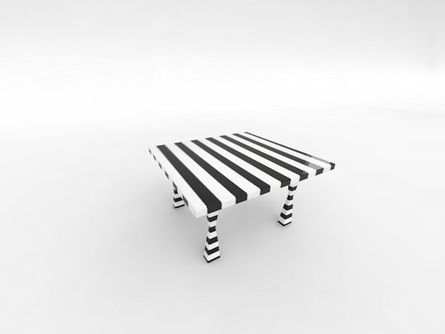
Pelt mapping is a very useful method of mapping untypical objects (like organic models, rocks, trees etc.) that are difficult to map in a standard way. It allows you to ’stretch your object’ on a plane and make it 2D. Then you can use other tools like ZBrush to create a great texture that perfectly fits your object. I’m going to use some simplier object here which is just a table. For your convenience I’m going to start with modeling process because that’s also important. Not every object will work here. You’ll always have to add a few more polygons for the simpliest objects in order to have them smoother inside of ZBrush. Take a look at my table which is already mapped.
Step 1
To begin with open up 3ds Max and create a box with dimensions like 22 for length, 24 for width and 1,5 for height. Add three lenght, three width and two height segments. Convert it to Editable Poly by right-clicking on it and going to Convert To: and selecting Editable Poly.
Step 2
Press 4 to enter Polygon sub-level of Editable Poly. Select corner polygons and use Inset on them with Amount like 3.
Step 3
Start extruding polygons that are meant to be legs of your table until you create something like this on images below.
Step 4
Now try to select all the edges that are borders of your object. Don’t select any edges inside because we want it to be a little bit chamfered only outside! Use Chamfer on edges you’ve just selected with amount of 0,1. We have to do it because we want to have more control over stroking polygons while increasing thier number inside ZBrush and don’t want to lose original shape what could make our texture doesn’t match with object when we’ll be back to 3ds Max.
Step 5
To check if you’d selected correct polygons you can select Nurms Subdivision. If it still does look correct it means you’ve done that correctly. Don’t forget to deselect it.
Step 6
Add a modifier called UVW Unwrap.
Step 7
Go to its sub-level called Face and select all the polygons that build leg of your table. Now choose Point to Point Seam and draw a line like mine.
Note:
- You can turn off Ignore Backfacing to select polys easier and on both sides at the same time.
Step 8
Once you finish drawing press Pelt. Notice that there’s a new option available down in the menu called Edit Pelt Map. Turn it on and press Simulate Pelt Pulling a few times. This will make your mesh stretched. You can see what’s going on in Edit UVWs window.
Note:
- In case the lines are overlapping you should first grab red points, scale them up a little using scale tool and simply redo Simulate Pelt Pulling a few times again
- If your lines are still overlapping make sure you’ve deselected Select Element option and you can grab some vertices and move them slightly
- In the event it still doesn’t work you have to draw other route to pelt it because one you’ve selected seems to be incorrect. In this particular case it will work fine.
Step 9
Now your mesh is stretched also in Edit… window.
Step 10
Do the same with the other legs. To stretch table top select all the polygons and again draw a line similar to mine. We can’t close it because if we would do it it will divide our mesh into two parts. Doing it it’s usually good to imagine that you’re cutting your object with knife and blue lines are places where will the hole be. Again use Pelt then Edit Pelt Map and finally Simulate Pelt Pulling a few times. Scale up red vertices if you need to and make sure your lines aren’t overlapping. When you are done close that window.
Step 11
Open up Edit… window again and place all your objects separately in the square with the thick black borders (actually they are dark blue but seem to be black). You can use tools like Move, Scale and Rotate if something doesn’t match.
Step 12
Now all mapping informations are assigned to this object so we can export it to ZBrush and paint that there not losing anything. Go to File -> Export… and export your object as a *.OBJ file.Step 13 – Inside of ZBrush
Import your *.obj file using Import an OBJ file function inside ZBrush. Now follow my screenshot to select correct ZBrush options. First click on Edit (1). After that choose Fast Shader 5 (2) material from the list to the left. Select MRGB insted of RGB and deselect Zadd. Increase number of polygons by going to Geometry -> Divide. We need them more to paint on that additional geometry. Last thing is to go to Texture and enable Colorize.Click on the screenshot below to enlarge.

A couple of things to note:
- Fast Shader 5 can be replaced with anything that allows you to clearly see the material so I think something bright will be great
- MRGB is a channel enabling you to edit material and not the object itself
- We’ve disabled Zadd because we don’t want to sculpt mesh but only paint on it (you can sculp your objects if you want to)
- Click on screenshot to enlarge
Step 14
You can choose any color (1) you like as well as brush size (2) and rotate, scale or move your object the way you need it using icons I’ve marked as 3. Start with painting table legs.
Step 15
To paint over table top press Shift and rotate your table until it will be exactly straight. We can use masks to mask some parts of our table that we don’t want to paint on. To do it press and hold Ctrl/CMD and choose the size of mask. Once you’ve done that you can paint regions you’ve chosen.
Notes:
- If you lose color you were using press C to get it back
- Obviously you’ll want to paint your object with normal textures. I’m using these stripes to show you how I’m usually doing it and to show you clearly that it works
Step 16
Once you’ve done that let’s create a texture from that by clicking on Col>Txr in Texture table. A new texture should apper to the left but it’s a bit different than the one from 3ds Max.
Step 17
It is flipped vertically so to flip it back go to Texture and find there option named Flip V.
Step 18
Finally we can export it for instance as a *.PSD file by clicking on the texture preview to the left.
Step 21
Go back to 3ds Max and press M to enter Material Editor. Choose any material slot and put a texture as its Diffuse using Bitmap. Select the table and again go to Edit in UVW Unwrap options. It should fit perfectly but in the event it doesn’t you can move some verticles slightly.
Conclusion
Check if your texture works on renders. If so you’ve just completed this tutorial and I hope you’ve learned something new. Please leave your thoughts about my tutorial below. Thank you!
Subscribe to:
Comments (Atom)