


Saturday, 12 February 2011
Create Vintage Style Zombie T-shirt
This tutorial, will show you how to create a vintage style zombie T-shirt. I will also give you a few hints on how to start your online T-shirt business and create a profitable source of passive income. This should be really useful for every freelance designer out there! So, let’s start!
Introduction
Most people make their T-shirt designs in applications like Adobe Illustrator, by using templates and creating paths. However, if you want to do something more complicated, especially a design including human figure, it’s easier to start with Photoshop. Of course you can make a very complicated design using paths, but it’s just much easier and less time-consuming to do it in Photoshop. I’m going to show you here how do I usually do it and then share some of my thoughts about T-shirt business and passive income which should bring you some decent money! Here’s what we are going to create:
Document settings
Create a CMYK document – I won’t be printing it myself so it’s just CMYK, 300 dpi, no special settings. Before you create anything, think twice where you’re going to post it or how you’re going to print it, imagine how it’s going to look on an actual T-shirt (or G-strings, Dog T-shirt, Hamster T-shirt) or whatever product you choose. Mine is going to be posted on Spreadshirt so let’s use 2200×3000 pixels for your document.
Sketching
It’s good to start with a very rough sketch of what you want to actually draw, without creating any details yet, just an overall vision of your design. It’s useful especially with drawing humans (or zombies, vampires or…any humanoid creatures ) when you need to pay attention to anatomy. I’m using here graphic tablet but this can be also done with standard mouse. If you start with a neat, bold line at the beginning, at some point it may turn out that you need to erase it, because, for instance, the whole composition looks bad, which may cause frustration and you may end up breaking up random objects in your workplace… Of course, we don’t want that. You don’t have to be obsessive about the anatomy, most people who buy your art don’t even notice when there’s something wrong. Just make sure the character doesn’t look crippled. I didn’t even use any reference images here (like photos, anatomy books), I just made that pose in front of my mirror and drew myself.
So, now once you have your sketch, double-click on the layer and lower its opacity. Then, create a new layer on top of it and start drawing for real. I draw with hard round brush, with only size jitter on. Opacity jitter is turned off – most printers don’t like any opacity jitter, gradients etc. Besides, a detailed realistic illustration doesn’t really look good when you wear it, it’s tacky and you don’t want to look stupid. I wear my own T-shirts, so… I’ll just go for a simple, vintage look.
Adding clipart
It’s better to put each element of your design on a separate layer, of course you don’t always have to do this, but it’s much easier when you want to change something (move, erase or most importantly – change colors). There’s the moon and banners, time for the bats. You don’t have to draw everything yourself, especially when it doesn’t involve any creativity. It just takes a lot of your time and effort. So, I sugest to just paste a free clipart bat here (the bat should be on a transparent background), place it wherever you want to, hold Alt/Option key + Click on it with ‘Move Tool (V)’ selected and drag it. It’s the easiest way to duplicate things. Keep duplicating and modifying bats just by using the ‘Move Tool (V)’ and transform controls. All clipart and resources can be found using Google Graphics, it’s the easiest way. Make sure they’re all free to use (for commercial purposes, too)! I also used some free clipart and some elements of my previous designs for the background, by pasting and modifying them just the same way I did with the bats. It’ easy so I don’t think you’ll have any problems with it. 
Finally, you can paste some irregular halftone pattern and place it around the shadows, for more ‘oldschool’ feeling. It’s best to use ‘Clone Stamp Tool (S)’ for that.
Coloring
The image is supposed to be visible on a dark background, so duplicate each layer (hold alt/option key + drag your layer down in the ‘layers’ palette) and fill it with white (using ‘Paint Bucket Tool (G)’). I’m not ready to commit coloristically yet. For the ornaments, bats and banners in the background I’ve added ‘Outer Glow’. Go to layer styles (double-click on a layer) and use the following settings:
Do it just once, then right-click on a layer to copy and paste layer style.
Now for the coloring part – I chose highly saturated colors (they won’t look so bright when printed!) and not many of them. In my case it’s just the matter of taste, but if you decide to print something on your own, remember that adding more colors = higher costs. Now if you don’t want the lightest colour to be white, Instead of colouring everything just create new adjustment layer ‘curves’ on top of it( don’t use layer fills!), double click on the ‘light’ sampler, choose the color you like and click with the sampler on the brightest place in the picture. Voila.

Now create a new layer on top of all layers (except the ‘curves’ layer), set it to ‘Multiply’ and paint all objects that are supposed to be red. Green is a complementary color for red and also the skin color of zombies, so paint your zombie with green (use the same brush settings as for the sketch). For the banners and the background motif, just click on their white fill layer, press Ctrl/CMD+Alt/Option+U and add colours using the ‘Colorize’ option.

Adding text
Now we’re going to add the text. The easiest way to make the text fit my banners is to type it on a path. To do this, make a new layer, choose pen tool and create a path (click where you want the path to start, then click where you want it to end – keep holding the mouse button (or tablet pen) and move it so that you can shape the path) then choose type tool and click on the path (once ‘T’ symbol appear) and you can type. Once you’ve typed anything interesting you can add some effects to the text, like outer glow (the way it’s described above). I added some black outer glow.
Final touch-ups
Create another layer just above the background layer and add some spatters with a custom brush. If you don’t have a spatter brush, create one yourself or google some – make sure they’re free to use for commercial purposes. Just save a brush on your computer and load it inside of Photoshop:
Then again make another layer on the very top and ‘damage’ the image a little bit with your custom grunge brush.
Final T-Shirt Design
Here’s my final T-shirt design:

You can also find it on my Spreadshirt page where I’m selling my designs. I’m really dissatisfied with Spreadshirt though. Their previews are always blurred, you can’t get better view on the design you want to buy and the shop layout is far from being user-friendly. I’m rather thinking of moving to Zazzle or RedBubble (they are both markets where you can sell your works). So, before you open your online T-shirt business, think about the things I listed above. They’re importaint from the buyer’s point of view. Selling T-shirts online will increase your passive income considerably and is basically easy. Actually, after a few this could bring you quite a lot money!
I hope this was helpful!

Here is a great collection of the 8 most awesome buildings of the decade. Modern buildings created by top architects are becoming more and more detailed, amazing and sometimes abstract these days. I’ve prepared a list of 8 of them that you can’t miss! They were all built in the past 10 years. Their order is random. Check them out!
#1 National Centre for the Performing Arts


The Building
Cost: €300 million ($430 million)Completed: July 2007
Location: Beijing, China
The building is an opera house in Beijing (also known as the ‘The Egg’). Its construction started on December 2001. It was designed by Paul Andreu.
#2 The Bird’s Nest Olympic Stadium, Beijing


The Building
Estimated Investment: $423 millionOpened: 28 June 2008
Location: Beijing, China
The building is a stadium in Beijing, China (also known as the National Stadium or Bird’s Nest). Its construction started on 24 December 2003. It was designed by a company called Herzog & de Meuron and Ai Weiwei (artistic consultant).
#3 Millennium Dome

The Building
Cost: £789 million ($1.28bn)Completed: 1999
Location: London, England
It is a large dome-shaped building, created to celebrate the beginning of the third millennium. It was designed by Richard Rogers.
#4 China Central Television Headquarters building


The Building
Estimated Investment: €850m ($1.2bn)Completion: Estimate mid 2010
Location: Beijing, China
The building is the headquarters of China Central Television. Its construction started on 22 September 2004. It was designed by two architects – Rem Koolhaas and Ole Scheeren.
#5 Burj Dubai
The Building
Cost: $1.5 billionCompleted: 4 January 2010
Location: Dubai, United Arab Emirates
Burj Dubai is a skyscraper in Dubai, and currently the tallest building in the world. Its construction started on January 2004. It was designed by Skidmore, Owings and Merrill.
#6 Millau Viaduct

The Bridge
Completed: 2004Location: France
It’s an enormous cable-stayed road-bridge. It was designed by Michel Virolgeux and Norman Foster.
#7 European Southern Observatory Hotel
The Building
Completed: 2003Location: Chile
Paranal Observatory in Chile is mainly used by scientists and engineers who work there.
#8 The Gherkin
The Building
Opened: 2004Location: London
The building is a skyscraper in London’s main financial district. Its construction started in 2001. It was designed by a company based in United Kingdom – Foster and Partners.
3D Future City
The City
Cost: $300 trillionEstimated Completion Date: 2200
Location: Mars
In this tutorial, I will show you how create really cool and exceptional light effects using Photoshop and a bit of 3ds Max. Let’s get started!
Light Effects
Here is a final image preview.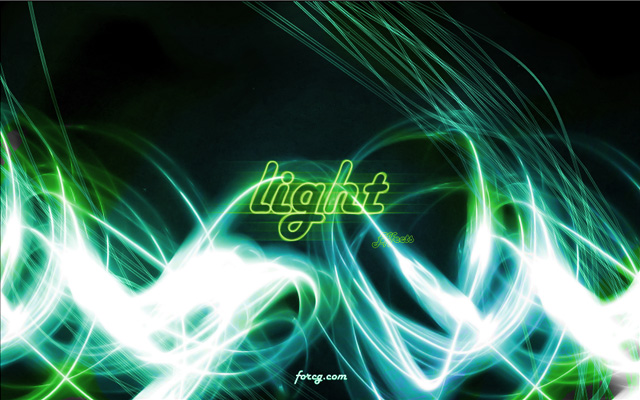
Step 1 – Light Paths
First of all open up your 3ds Max (or any other 3D application) and create a few paths like on the image below. Their placement is random. I’ve created around 20 of them. These will be our light strokes.
Step 2
Select each one and make each renderable. In order to make them visible in renders go to their propetries (to the right in your sidebar) and select “Enable in Render” as well as “Enable in Viewport”. You may also change “steps” under “Interpolation” to something like 16. This will make each light stroke smoother.
Step 3
Hit ‘M’ on your keyboard to get to the ‘Material Editor’ and select the first material. Use the setting below for this material and apply it to your light strokes. You may also modify it a bit if it doesn’t look alright.
Step 4
Scale your light strokes in one direction (like on the image below). Move your camera around and find it a good placement (see my example).
Step 5
Once you’ve done everything render your scene. I used VRay here with Global Illumination turned on. Other rendering engines should work fine here, too. Here is what I got (originally I used 1680×1050px resolution).
Step 6
Once all that is done save your render as Targa or Tiff image (*.tga or *.tiff – I used .tga) in order to have your alpha channel baked into the file. Use Adobe Photoshop to open it. Desaturate your render and use its alpha channel to remove black bacground. To begin with fill the background layer with pure black color.
Step 7
Use ‘Type Tool (T)’ to create a ‘light effects‘ text. Go to its ‘layer styles’ and decrease its ‘Fill opacity’ to 0%.
Step 8
Duplicate this layer and go to ‘Filter -> Blur -> Motion Blur’. Use 0 degrees for angle and around 40 pixels for distance.
Step 9
I’ve pasted a star field image in the background and used a ‘Hue/Saturation…’ layer with hue set to 87, saturation to 58 and lightness to 0. Alternatively you can use your ‘Brush Tool (B)’ to paint some lighter areas in the center.
Step 10
The image is ready but you can improve it even more by adding there some light strokes created with brushes like these available on ColorBurned – 46 Stunning High Resolution Photoshop Light Effect Brushes.Conclusion
I hope you like it. Click on the preview image to get the full size image.
This tutorial will show you how to create an awesome apple wallpaper using 3ds Max and Photoshop! There are a few versions available! Check it out!
Apple Wallpaper Preview
Here is what we are going to create (there are a few more versions):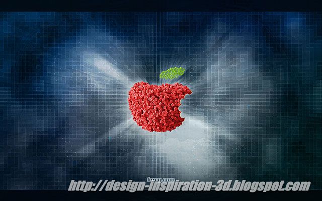

Step 1
Open up the Adobe Photoshop and create a new document with dimensions set to 1680 x 1050px. Fill the background layer with black using “Paint Bucket Tool (G)”.
Step 2
Create another layer and fill it with black. Set your colors to black and white an go to ‘Filter -> Render -> Clouds’ (hold alt key to make the effect stronger). After that go to ‘Filter -> Pixelate -> Mosaic’ and set ‘Cell Size’ to 19. Optionally you can improve your image even more by going to ‘Filter -> Noise -> Median’ (set its radius to two pixels).
Step 3
Afterwards duplicate this layer and go to ‘Filter -> Stylize -> Glowing Edges’. Use one for edge width (can be more), 20 for edge brightness (can be less) and seven for smoothness. Set this layer to a ‘Soft Light’ blending mode. If it doesn’t look like mine try to adjust its contrast and brightness.
Step 4
Paint something like on the image below on a new layer and duplicate this layer four times.
Step 5
Set the first one to ‘Color’. Select the second and go to ‘Filter -> Blur -> Gaussian Blur…’. Blur it a lot (set the radius to something between 100 and 200 pixels). Set this layer to Color. Set the third layer to ‘Color’ again and fourth to ‘Vivid Light’ but decreare its opacity to something like 50%. Finally you should get something like this (if not play with the Brightness/Contrast again):
Step 6
Grab your layer with ‘Glowing Edges’ filter applied and duplicate it. Lower its brightness and increase its contrast. It should start glowing in some places like on the image below. If necessary, duplicate this layer and change its blending mode (I used ‘Exclusion’ with opacity set to 45% here).
Background is ready. You can make it even better by adding in some little details or by duplicating some of the layers you’ve created and using radial blur on them (with mode set to ‘Zoom’). I’m leaving it up to you.
Step 7
Now open up your 3ds Max and create an apple. I doesn’t have to be perfect at all. Just a sphere with a few top verties moved a bit upwards would be enough. Take a look at my example. It’s just a sphere with ‘Edit Poly’ modifier applied. I used ‘Soft Selection’ to move more vertices at once.
Step 8
Hit ‘6′ to get to the ‘Particle View’ and create a new particle system like on my image. Make sure you’ve added your apple to the ‘Position object’ and selected ‘Location: Volume’.
Step 9
Move your time slider a little bit further (like 30th frame), place your camera like me (see the image below) and hit ‘Render’. I used VRay as my rendering engine but you can get similar results with almost any other engine.
Step 10
Move your render to the Photoshop and remove black background (you can use either its alpha mask or ‘Magic Wand Tool’ which works fine in this case). Duplicate your apple and go to ‘Filter -> Stylize -> Glowing Edges’ again. Use the same settings as previously and once you are done set this layer to ‘Color Dodge’. Your apple should look like the one below (I forgot about the leaf but it will be back in the final images ).
).
Step 11
Finally you can use ‘Pen Tool’ or ‘Brush Tool’ to draw a jaw shape and mask it. I’ve made some little changes to the background afterwards. There are two versions of this wallpaper. It’s also a good idea to remove the apple and replace it with something else or leave an empty space there. Take a look at two of my versions!Conclusion
That is all for now and since it’s 31th December today I wish you happy and creative New Year! If it was useful for you please do us a favour and share it with the others!